Rubrik is a B2B software platform that delivers backup, recovery, analytics, and compliance across data centers and clouds.
Projects include:
A/B Testing Optimization Program
Custom campaign landing pages
Component Library
Full AEM website re-design and re-platform
A video demo hub
Partner portal optimization
Website Redesign/Replatform
Goals
1. Bring People Along
The Rubrik story and product offerings are evolving, and there is a tendency to focus on what is new, and how the business is maturing. We must find a way to tell people about where Rubrik is headed without losing the foundation (flagship product: backup and recovery, cloud data management).
2. Contextualize
With a diverse buyer and influencer group that spans multiple industries and use cases – a key component of success is weaving customer stories into the website content, so users understand the value of Rubrik in a relatable way.
3. Engage with Content
Data shows that users who spend more time engaging with and consuming content, have the highest propensity of becoming customers. We must provide content rich experiences that promote consumption and continued engagement at each stage of the journey.
Stakeholder Interviews
We heard a few common themes by interviewing 9 teams including: Web, Creative, Partners, Customers, Product Marketing, Product Design, Web Attribution, People Operations, Demand Generation, & Executives.
“We want to grow up a bit— we’re not just back-up & recovery anymore— we’re solving a BIGGER problem now.”
“The web experience must evoke the same sense of ease and simplicity that one can expect from Rubrik products.”
“We want people to say OH I need that product! I want to talk to Rubrik.”
We need to make the brand, product and vision understandable.
We need to understand the most relevant pain points, triggers and concerns that resonate with all users — and specific audience types.
Existing Site: Areas for Improvement
Simplicity — Sifting through the content noise… what does Rubrik really do?
Growth — Presenting Rubrik as a B2B enterprise solution (instead of a start-up)
Messaging — Doesn’t speak at all to the economic buyer (i.e. CTO, IT Manager)
Storytelling — Presenting relatable customer stories and industry/peer validation
Design — Typographic hierarchy makes information appear more complex than it is
Web Audiences
Buyer’s Journey
Awareness
Research & Evaluation
Comparison & Costs
Landscape Review
Messaging Strategy
Why Rubrik
Evergreen differentiators
Should relate directly to new Multi-Cloud Data Control messaging
Answer “Why Should I pick Rubrik?”
Homepage
Focus on the needs of the economic buyer and prospective customer
End-user centric -- not a billboard for executives to shout latest news, announcements or even new products
Audience is trying to do or find something and you have to support them in their mission to find a solution
Homepage Goals
User Goals
User who finds the home page usually search by URL or used a search engine to search by company name
User should identify with the company offering, use cases and or products they need
Find information about the products/solutions they are researching
Learn more about the company
Look for job listings, partner, or investors section
Rubrik Goals
Educate: Help user identify with Rubrik and its offerings
Convert: (if anonymous) By trading valuable assets, or teasing out information or wizards that engage the user and make them want to continue the communication
Help users who are returning or authenticated engage with most relevant content and do research
Build trust between end user and company
Show other customers, or 3rd party white papers that validate brand
Case Studies / Resources
Page Anatomy
Brand messaging
Promoted content
Address pain points & offer solutions
Platform explanation & lead generation tool
Credibility & case studies
Recognizable technology partners
Key resource & lead generation opportunity
Other Key Wireframes
Post Site-Launch: Conversion Rate Optimization
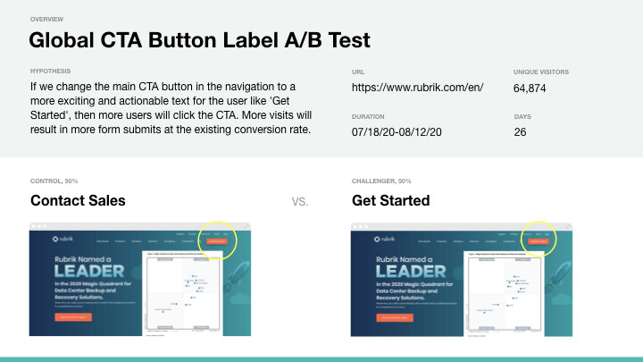
As part of the conversion rate optimization program, we brainstormed and reviewed this ideas tracker each week to prioritize our next initiative based on specific pre-set level of effort, impact and business goal criteria.
Specific test plan intake sheets including key info such as test objective, type of test, start date, duration, variables, traffic split, success criteria etc.


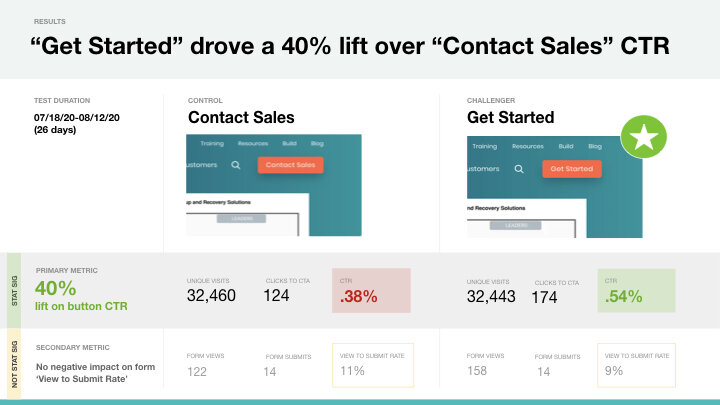
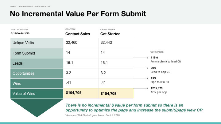
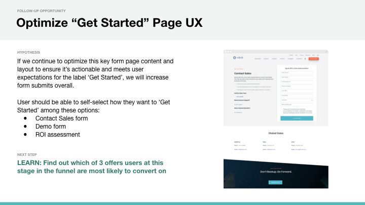
Testing Results
Partner Portal Optimization Project
Goals:
UX for templates and components that can be leveraged in the future as new features and functionality are introduced to the portal
Dramatic improvements to user experience that still adhere to technical and resource constraints
Updated styling to align with Rubrik.com look and feel
Wireframes:
Leverages Salesforce Lightning components (with light Rubrik styling)
General layout and functionality
Content is for placeholder only (or best recommendation)
Modular build: components can be optional
Used to identify the style options for reusable building blocks (i.e. a card)
Provide a scalable component toolkit for authors to create flexible page layouts
Strategy
Utilitarian
Users are here to complete a task
Leverage existing UX patterns and components
Prioritization of Content
Use images/background colors purposefully, not for decoration
Create prominence hierarchy using text, size, color
Task-focused layouts
Keep core content above the fold
UX Recommendations
Quick access to information partners (and others) need to better sell and market Rubrik solutions
A friendly welcome to the partner
Links to key parts of the partner portal (i.e. deal registration)
Latest resources available to them (i.e. new or added materials to the resource library)
News and information specific to partners (i.e. campaigns and promotions)
Key Sections for Easy Access:
Deal Registration
Leads
Market Development Funds (MDF)
Library Resources
Training / Certification
Channel team
Utilitarian
Users are here to complete a task
Leverage existing UX patterns and components
1. Homepage, 2. Listing template, 3. Deals template and 4. Detail template
5. Resources, 6. My Profile, 7. Search Results, 8. Partner Scorecard
Component Library, Layout & Styling Options
Due to confidentially restraints I'm not able to disclose details of specific business challenges and our solutions. Contact me for a more in depth explanation of our thinking process and reasoning.


