
Optum’s Prism application, also known as Member Profile, brings together information from various clinical sources into a single view. It provides nurses, care coordinators, and others with a comprehensive and easily scannable overview of the member's health, enabling informed healthcare decision-making for that patient.
Initiatives include:
Advocating for users and the UX process in a heavily engineering-focused product development and scrum team
Common pattern contributions presented to the cross-product design committee
Leading weekly prioritization and resource management across 4 designers
Accessibility reviews and defect resolutions
Integration of new features: requirements gathering, UX groundwork, UI solution, engineering handoff, audit post-implementation
Conducting informal user input sessions based on low/medium fidelity mock-ups
Design system gap identification and leading component submission requests
Application Vision
The vision of Prism is to revolutionize patient care by seamlessly connecting critical data from all aspects of the healthcare journey and care teams. By simplifying the user experience of applications clinicians use to make decisions, Prism empowers them to adopt a holistic approach, providing the best possible care for patients.

Pain Points
I led a team of UX Designers to address pain points that users encountered with the legacy hard-to-read and hard-to-understand healthcare applications including:
Disjointed view of member data: The old application had separate views for member data, making it difficult for users to get a comprehensive understanding of a member's health history.
Switching between different apps: Users had to switch between different apps to find data from unique systems, which was a cumbersome and time-consuming process.
Ineffective communication of raw data: The raw data in the old application was presented in a confusing and hard-to-understand format, making it challenging for users to make informed decisions.
Outdated technical architecture: The old application had outdated technical architecture that made it difficult to integrate new data sources and maintain data quality.

Representation of the many disjointed experiences within Optum’s clinical manager products
Competitor Review

We reviewed best-in-class EHR products with similar use cases including: Google Care Studio & Salesforce Patient 360 .
Key End Users
It's crucial to design products like Prism with flexibility in mind due to the diverse users, use cases, and integration possibilities with other medical services. By employing a plug-and-play approach that accommodates various user needs, Prism became adaptable to different healthcare scenarios, allowing seamless integration with other systems while providing a personalized experience. This flexibility ensures that the application can be tailored to meet the specific requirements of medical directors, behavioral health specialists, nurses, care coordinators, and other end users, enhancing usability and delivering value across the healthcare ecosystem. Users should be able to customize the data shown within their dashboard to display the most important information to them.

Our team prioritized plug-and-play layouts when considering how the data modules could appear on the dashboard since there were several users and use cases and we needed to enable users to have ultimate flexibility.
User Input
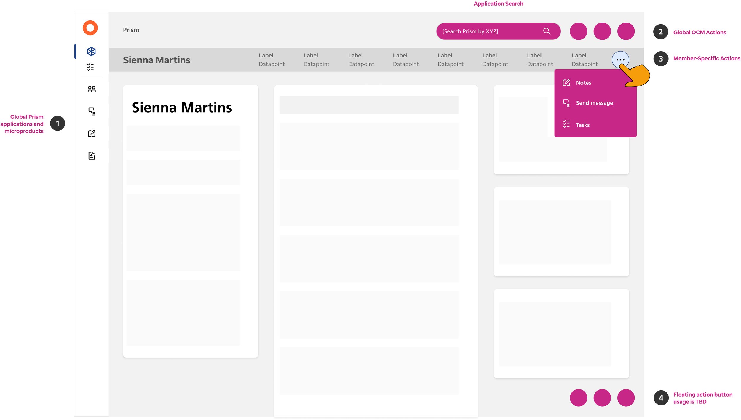
During user interviews, nurses emphasized the significance of prominently displaying 'admissions, discharges, and transfers' data on the member’s landing page. Their feedback highlighted the critical nature of ADTs, as it helps ensure they don’t miss it. (Admissions, discharges, and transfers (ADTs) refer to the process of admitting patients to a healthcare facility, discharging them from the facility, or transferring them between different care settings.) Obtaining direct feedback from end users through real conversations is invaluable, as it allows us to move beyond assumptions and address actual pain points, resulting in a user-centric design that meets their specific needs and enhances their workflow.
Questions to Consider
How can we reduce cognitive load for users when viewing the landing page? How can we work with Product Owners to help prioritize what appears on the landing page?
How do the core use cases of Prism differ for each product implementation (Utilization Management vs. Care Management)? What do these differences mean for the way the page is structured for users?

A few (of many) landing page iterations from outline to implementation
Topics of Consideration
Updating color contrasts and removing decorative colored icons to meet accessibility compliance vs. receiving key stakeholder approvals (who requested to ‘make it prettier’)
Weighing pros and cons of a 2 column vs. 3 column layout
Deciding if we should maintain datapoint consistency across modules vs. displaying only datapoints that end users find most relevant
Deciding on rules re: page-level scroll vs. scrollability within each module
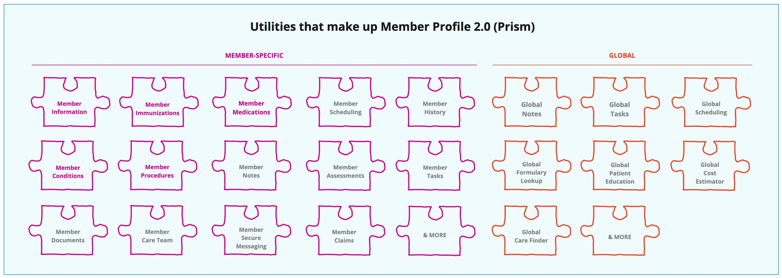
Product Ecosystem

Since we were working very quickly, we recognized the importance of creating an organized mapping of the hierarchy and structure of the utilities that make up our product. What areas of the product would new content be added to? What is the structure of these new capabilities? Are the capabilities all of equal importance or do we need to account for a hierarchy?
Reviews & Feedback in Figjam

Advocating for Users & the UX Process
Leading a team of four UX designers was both challenging and fulfilling since we worked on a product with a tight timeline and immense potential, aiming to combine over 20 capabilities into a scalable solution for various types of end users. Due to the product managers' relative newness to their roles and the established engineering team, both teams needed guidance in effectively collaborating with UX designers.
To address this, I facilitated mini UX workshops within my design team to establish and iterate on our ideal process, subsequently devising a plan for incremental improvements with the product and engineering teams over multiple sprints. Achieving buy-in for this process involved time and collaboration with other UX teams, as we navigated the rapid growth and shifting business priorities, ensuring our focus remained on advocating for our end users.
Proposed UX Process

Despite this process diagram being linear, each UX review session needed to prompt time for additional iterations / feedback implementation. Block types include: engineering/product groundwork, UX groundwork, UI work, review sessions, and approvals.
Process Challenges
Requirement Changes: sometimes, as concepts are developed, it uncovers additional complexity or causes a shift in the user or business needs
Feedback loop: consistent input on what we’re building from users and SMEs
Time for UX groundwork: use case and end user understanding aka UX groundwork (due to the design system - product owners thought we could slap page designers together way more quickly)
Time for reviews: UX reviews, accessibility reviews, design system reviews, engineering check-ins, product owner reviews before grooming the topic with the wider UX, product, engineering group
UX Task Tracking

We collaborated with the scrum master to determine the best way to integrate UX tasks — and how to track those tasks — within the existing engineering ticket management system, “Rally”.
Managing Priorities

I used Miro to lead prioritization exercises with our product management and leadership team to ensure the UX team was focused on the appropriate upcoming initiatives.
Tokens & Theming
The Optum design system leveraged a token system in all products, enabling easy ‘1-click’ swapping of application styles between 2 distinct ‘gold’ and ‘azul’ themes. In the future, the vision is to make Prism available for white-labeling, allowing external companies to acquire rights to the platform and leverage its capabilities. When this happens, the tokenization will become even more important because those external companies will have their own colors, fonts, icons, type styles, spacing increments etc. which Prism will be able to easily update to match.


Leading Design System Contributions
As a top contributor within the Cross-Product Design Committee at Optum, I played a significant role in shaping the organisms and templates that make up a page. Given the company's vast portfolio of over 100 products, I identified common patterns, conducted thorough audits, and then make UI recommendations that would efficiently meet the needs of all products. Examples of my contributions include developing consistent layouts for common components such as the top navigation, side navigation, member banners, filtering, and tables.

Member banner pattern audit across several products

Recommendations for consistent top and side navigation structures across products
Table vs. Card Pattern Usage
Data tables and cards are both popular UI design patterns for displaying information. However, there are pros and cons to each approach, and I helped designers choose the right approach based on the specific needs of their users.
Pros of Data Tables
Compact way to display large amounts of data
Easier to compare and sort data
Better for displaying quantitative data
Can be easier to navigate with keyboard shortcuts
Pros of Cards
Provide a more visually engaging and intuitive way to display information
Easier to scan and digest for users
Can be made responsive for smaller screens
Better for displaying visual content

Product Icon Exploration

Due to confidentially restraints I'm not able to disclose details of specific business challenges and our solutions. Contact me for a more in depth explanation of our thinking process and reasoning.