
MIT Technology Review is a world-renowned digital media company focused on publishing insights and analysis to explain cutting edge technology and its commercial, social and political impacts.
Project Overview
Collaborating with in-house UX and product team to scope and strategize implications of a website redesign on a custom CMS. I designed new storytelling features and content management dashboard with an emphasis on usability, flexibility, and time-to-launch.
Highlights: Authoring User Flows • Custom CMS UX/UI Design
Challenge
MIT Technology Review worked with a digital agency to redesign and modernize their existing consumer-facing website. They setup a lot of design guidelines for how the website should look — but failed to consider and setup a process/structure for the internal publishing team at MITTR.
What I Did
Wireframes/UX for new CMS platform
UI Design for new CMS platform
“How It Works” rules & documentation for end users
Feature request prioritization
End user interviews (with writers, editors, publishers, and designers)
Observance of editoral meetings to understand the end-to-end process of a story from ideation to publication
User feedback sessions with end users
Target Audiences
Article writers, editors, producers, designers and final publishers. See how they all fit together below.

Challenges
The new custom CMS is limited in its phase 1 functionality — how can we prioritize phase 2 features based on impact and dev level of effort? Here a few of the many examples of ‘wishlist’ asks we heard from direct interviews with writers and editors on the team:
Writers want to write stories using robust content platforms — not a basic web content management system.
The current process involved a writer usually drafting an initial story in Google Docs because there is advanced saving, commenting and track changes (functionality that the new CMS couldn’t support yet). Then, the content, images, and article metadata would have to be ported over to the CMS right before launch. This caused publishing delays, last minute issues, content discrepancies and generally extra work for the internal digital team.
Writers want to write and see their stories exactly how they’ll appear on desktop and mobile devices — before they launch.
The current process didn’t allow for modern ‘drag-and-drop’ placement of images, easy text or formatting changes, or a mobile layout view. Upon publishing, unexpected text/image layout changes and text length limitations often occurred which caused revisions and rollbacks.
Editors and publishers want to be able to schedule article launches in advance — and easily promote them across the site.
Editors and writers want the ability to start an article idea — without having to fill out allll the required metadata information that a publish-able article needs.
Feature Prioritization
We used these scales and labels to determine when a requested feature should be focused on next:
Effort scale
Low Effort: 1 week or less of dev work
Medium Effort: 1 to 3 weeks of dev work
High Effort: 3 or more weeks of dev work
Impact Scale
Low Impact: Matters to only a few people, maybe internal to Prod Dev, has low visibility, affects a very small portion of the experience
Medium Impact: Interests and satisfies some users, affects multiple screens or a key task
High Impact: Fixes a major problem, simplifies a task, significantly improves a flow, many people will notice
Story Units

A story can be made up of the following components.


UX & Layout — In Progress


Story Builder Wireframes
To ensure the simplest process for writers and producers we determined all story details & metadata should be editable in the left rail, while the main content area is used to enter content and toggle between the ‘Write’ mode and the ‘Layout’ mode. This allows end users to quickly view how a story will look without all the weight of visual styling and images distracting from the text formatting view.


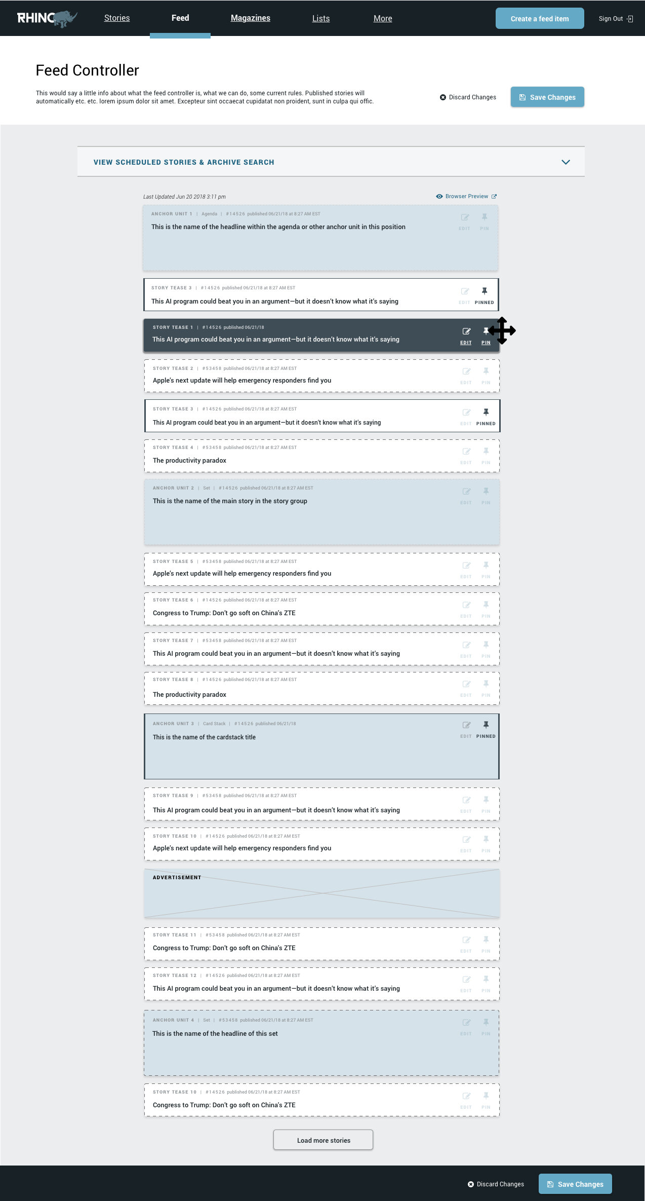
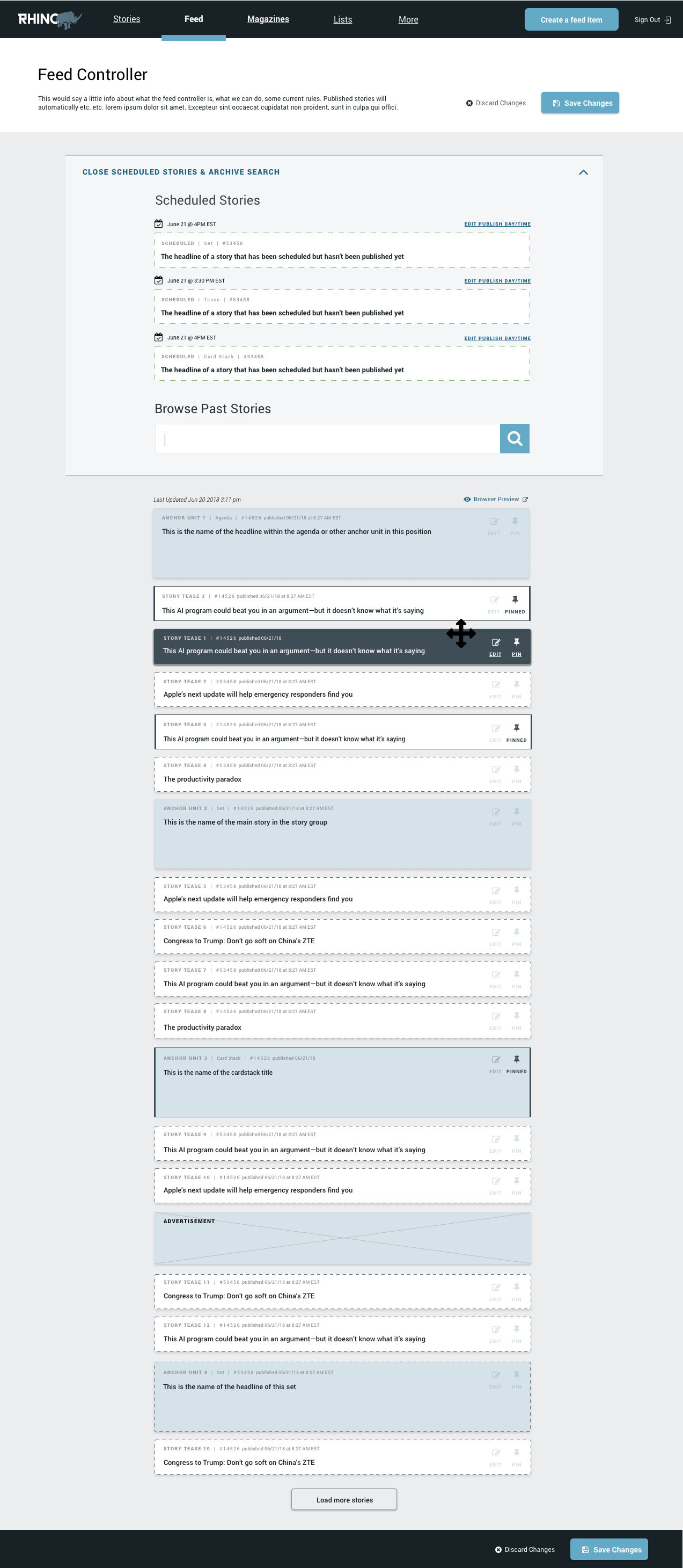
Homepage Feed Controller Wireframes
On the left is the old homepage feed. It was a static listing view where it wasn’t even possible to view what story titles were being promoted — or what stories would be auto-published soon.
On the right is the new homepage feed which visually shows how producers can easily set scheduled stories to publish to the top of the page, drag and drop stories to a different location, pin a story so it maintains its location in the feed, delete a story, or edit a story.

Anchor Builder Wireframes


Card Stacks Wireframes


UI Design
After the wireframes were approved, I had the opportunity to design out the platform based on existing brand treatments while also taking design liberties as needed.
Inspiration
I reviewed multiple web publishing tools such as Wordpress, Flockler, Parsely and Squarespace.

UI Scratchpad

Story Builder


Feed Builder


Feed Controller
Due to confidentially restraints I'm not able to disclose details of specific business challenges and our solutions. Contact me for a more in depth explanation of our thinking process and reasoning.